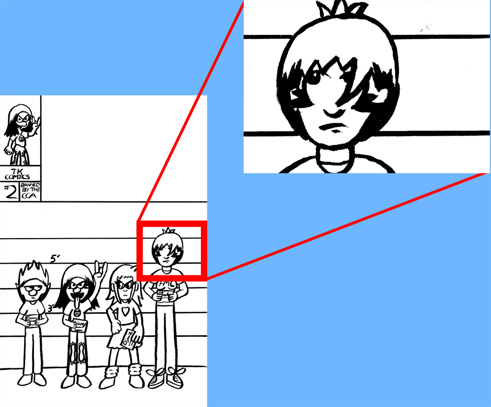
I’ve updated the “Books” and “Comic Pages” sections with some new material, along with posting this “Making of”.
I wanted to post a step-by-step process on how I make a comic page. Now, I’ve done similar step-by-step processes in the past, but I wanted to go more in-depth this time.
First up, these are just some of the tools I use to make a page:
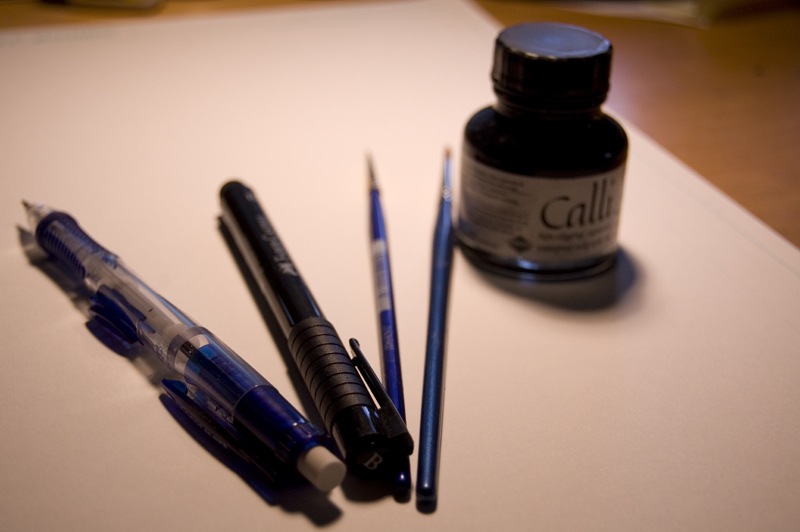
I use a blue pencil to sketch out the characters, as well as some rough lettering and panel outlines. I use a brush pen to ink the panel outlines, a small brush to do the lettering and word balloons, and a larger brush to ink the characters and backgrounds.
A sketch of the page:
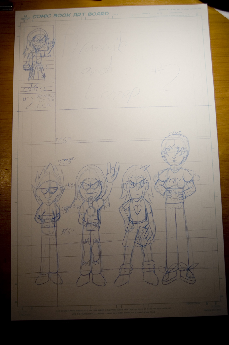
This page will eventually become the cover. The next step for me is to make the straight lines using the brush pen and a t-square:
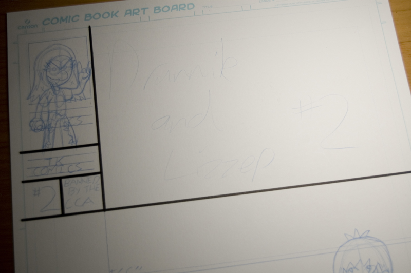
Next up is the lettering portion. Because the cover doesn’t require much lettering, it’s just this small portion:
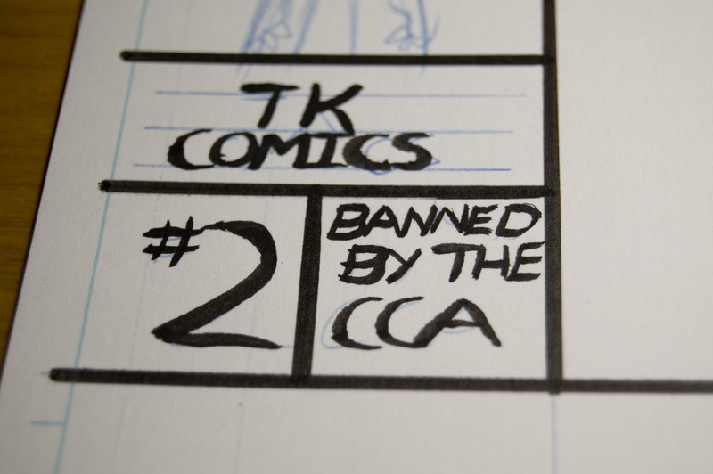
I’ve been lettering with a small brush lately as I like the aesthetic of it. It has a feel to it that I just could not replicate with a pen or on a computer.
Finally, I ink the characters and whatever background elements there are:
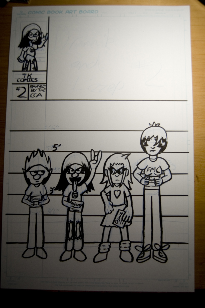
Of course, this isn’t the end. After this, the image has to be scanned to make further adjustments. Unfortunately, I do not have a large format scanner, and since I work relatively large, I have to piecemeal different scans together and try to make a somewhat cohesive whole out of it. This is the result:
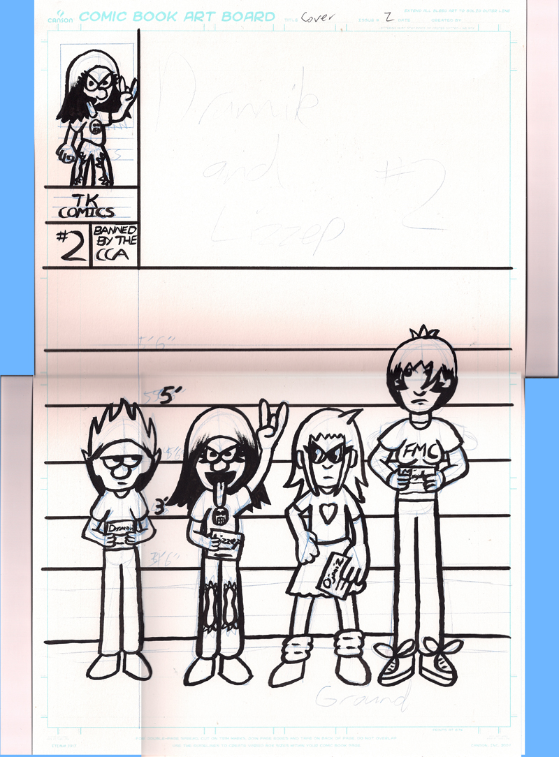
After this whole process is finished, I crop out any unneeded elements, then adjust the color channels and the contrast to make the ink lines stand out more, as well as fade out the original pencils:
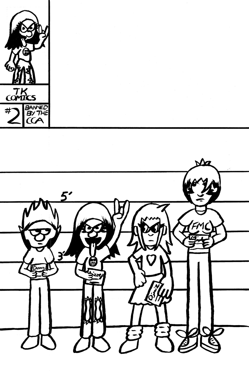
However, this process isn’t perfect. Oftentimes, there are extra white or black pixels that need to be corrected or else the next step of the process won’t work right:
After all of the pixels have been corrected, the time comes to take the page to Illustrator. From here, I live-trace it:
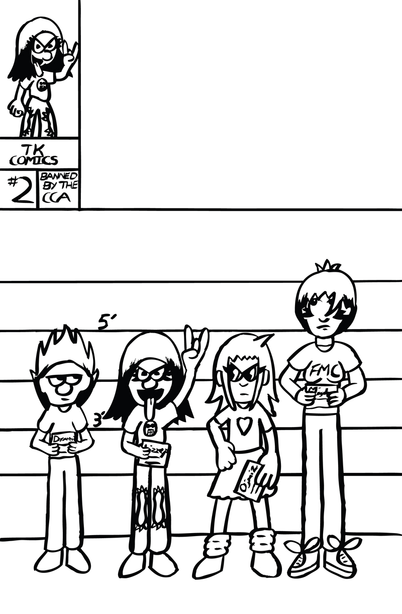
Normally, because the regular comic pages are in black and white to cut costs, this would be the final step, but since this is the cover, there must be some color to it as well, right?
To give this image some color, I create live-paint paths, which allow me to apply flat colors to the characters and background:
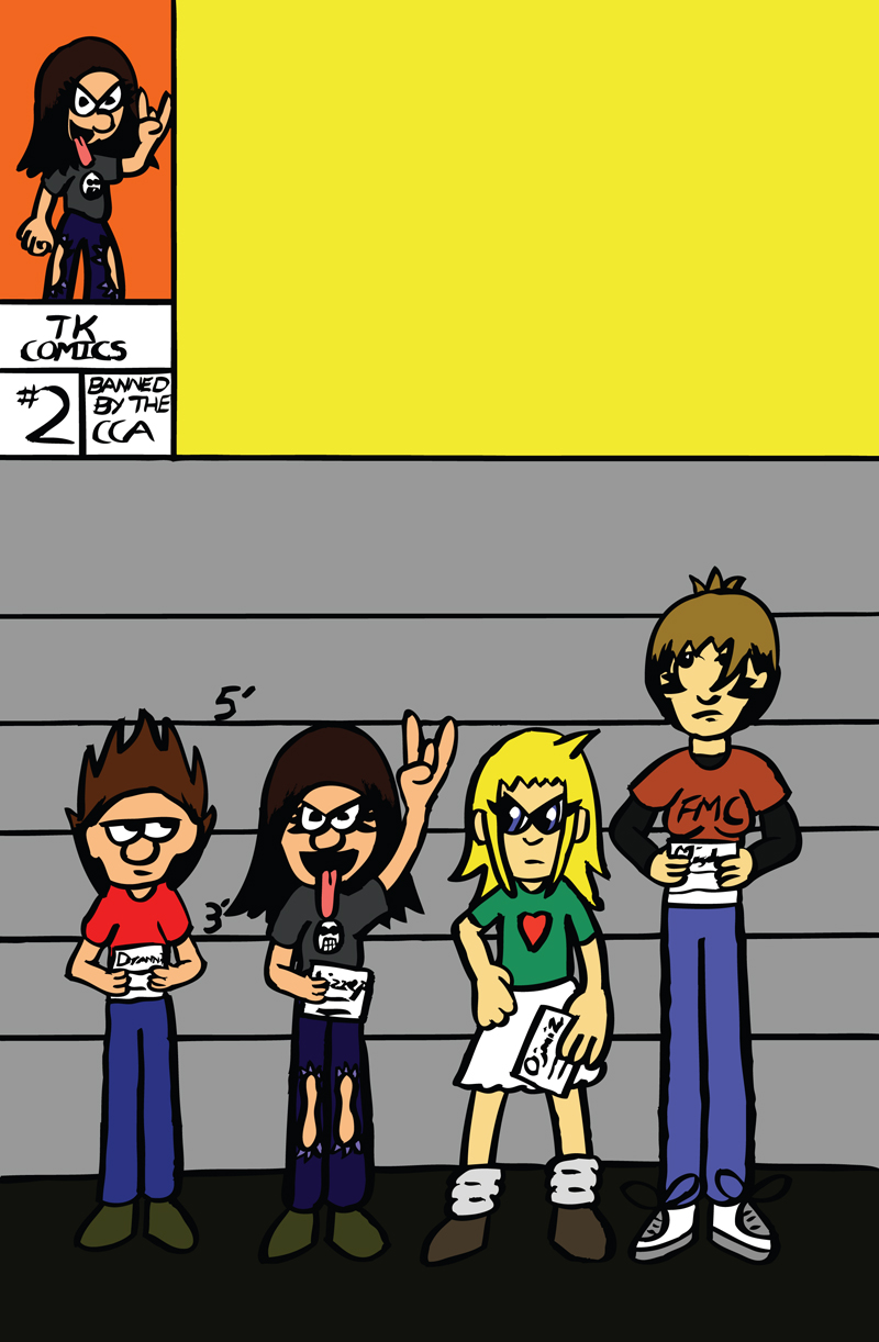
Finally, I create any shadows and highlights I need, and since this is the cover, the “Drannik and Lizzep” title logo must also be put in place as well:
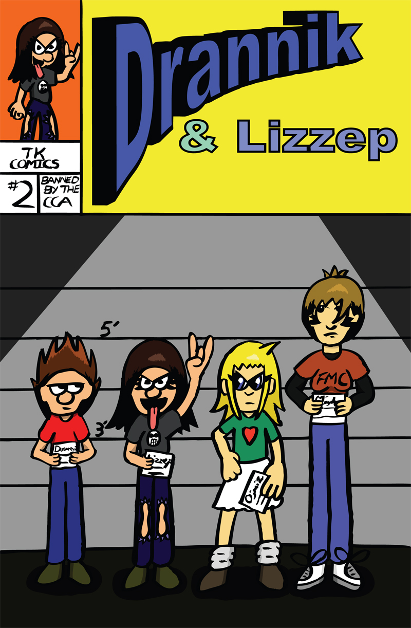
And that’s how I go about making a comic page.

